Python使用matplotlib和pandas实现的画图操作【经典示例】
本文实例讲述了Python使用matplotlib和pandas实现的画图操作。分享给大家供大家参考,具体如下:
画图在工作再所难免,尤其在做数据探索时候,下面总结了一些关于python画图的例子
#encoding:utf-8
'''''
Created on 2015年9月11日
@author: ZHOUMEIXU204
'''
# pylab 是 matplotlib 面向对象绘图库的一个接口。它的语法和 Matlab 十分相近
import pandas as pd
#from ggplot import *
import numpy as np
import matplotlib.pyplot as plt
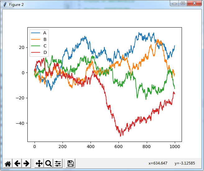
df=pd.DataFrame(np.random.randn(1000,4),columns=list('ABCD'))
df=df.cumsum()
print(plt.figure())
print(df.plot())
print(plt.show())
# print(ggplot(df,aes(x='A',y='B'))+geom_point())
运行效果:
# 画简单的图形
from pylab import *
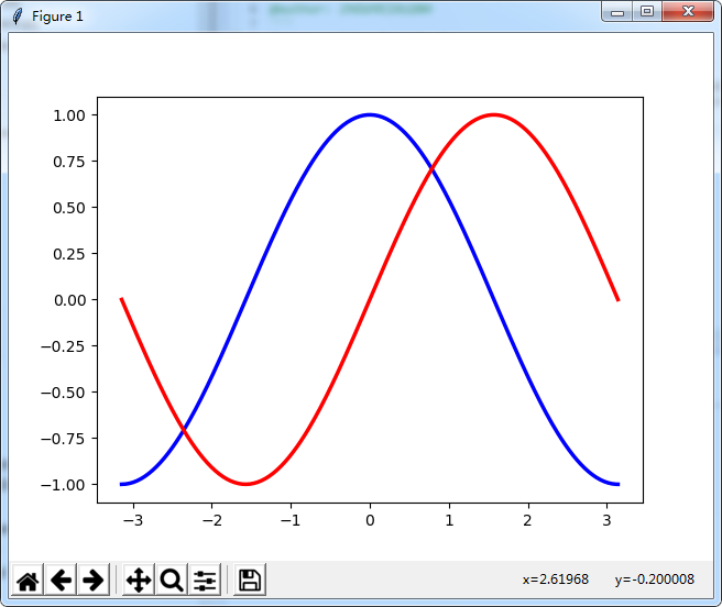
x=np.linspace(-np.pi,np.pi,256,endpoint=True)
c,s=np.cos(x),np.sin(x)
plot(x,c, color="blue", linewidth=2.5, linestyle="-", label="cosine") #label用于标签显示问题
plot(x,s,color="red", linewidth=2.5, linestyle="-", label="sine")
show()
运行效果:
#散点图
from pylab import *
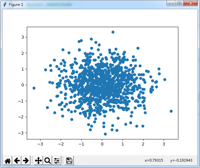
n = 1024
X = np.random.normal(0,1,n)
Y = np.random.normal(0,1,n)
scatter(X,Y)
show()
运行效果:
#条形图
from pylab import *
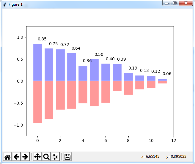
n = 12
X = np.arange(n)
Y1 = (1-X/float(n)) * np.random.uniform(0.5,1.0,n)
Y2 = (1-X/float(n)) * np.random.uniform(0.5,1.0,n)
bar(X, +Y1, facecolor='#9999ff', edgecolor='white')
bar(X, -Y2, facecolor='#ff9999', edgecolor='white')
for x,y in zip(X,Y1):
 text(x+0.4, y+0.05, '%.2f' % y, ha='center', va= 'bottom')
ylim(-1.25,+1.25)
show()
运行效果:
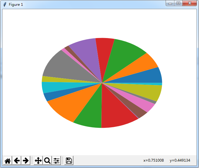
#饼图
from pylab import *
n = 20
Z = np.random.uniform(0,1,n)
pie(Z), show()
运行效果:
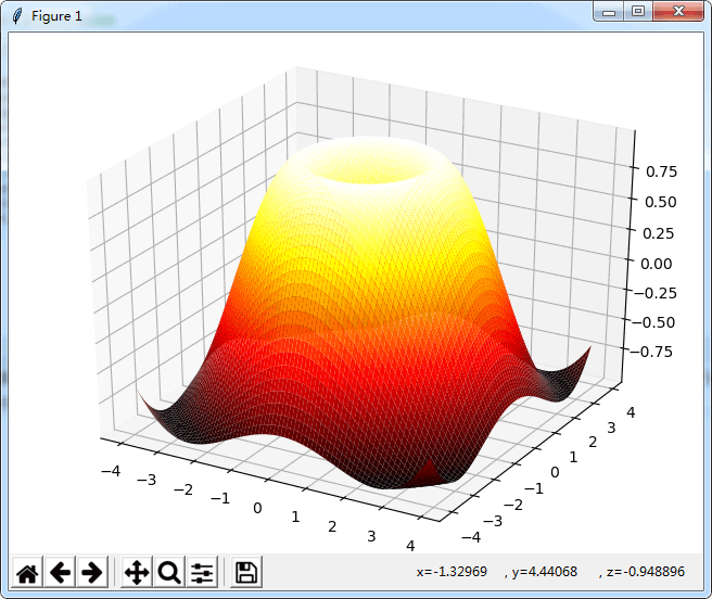
#画三维图
import numpy as np
from mpl_toolkits.mplot3d import Axes3D
from pylab import *
fig=figure()
ax=Axes3D(fig)
x=np.arange(-4,4,0.1)
y=np.arange(-4,4,0.1)
x,y=np.meshgrid(x,y)
R=np.sqrt(x**2+y**2)
z=np.sin(R)
ax.plot_surface(x,y,z,rstride=1,cstride=1,cmap='hot')
show()
运行效果:
#用于图像显示的问题
import matplotlib.pyplot as plt
import pandas as pd
weights_dataframe=pd.DataFrame()
plt.figure()
plt.plot(weights_dataframe.weights_ij,weights_dataframe.weights_x1,label='weights_x1')
plt.plot(weights_dataframe.weights_ij,weights_dataframe.weights_x0,label='weights_x0')
plt.plot(weights_dataframe.weights_ij,weights_dataframe.weights_x2,label='weights_x2')
plt.legend(loc='upper right') #用于标签显示问题
plt.xlabel(u"迭代次数", fontproperties='SimHei')
plt.ylabel(u"参数变化", fontproperties='SimHei')
plt.title(u"迭代次数显示", fontproperties='SimHei') #fontproperties='SimHei' 用于可以显示中文
plt.show()
import matplotlib.pyplot as plt
from numpy.random import random
colors = ['b', 'c', 'y', 'm', 'r']
lo = plt.scatter(random(10), random(10), marker='x', color=colors[0])
ll = plt.scatter(random(10), random(10), marker='o', color=colors[0])
l = plt.scatter(random(10), random(10), marker='o', color=colors[1])
a = plt.scatter(random(10), random(10), marker='o', color=colors[2])
h = plt.scatter(random(10), random(10), marker='o', color=colors[3])
hh = plt.scatter(random(10), random(10), marker='o', color=colors[4])
ho = plt.scatter(random(10), random(10), marker='x', color=colors[4])
plt.legend((lo, ll, l, a, h, hh, ho),
   ('Low Outlier', 'LoLo', 'Lo', 'Average', 'Hi', 'HiHi', 'High Outlier'),
   scatterpoints=1,
   loc='lower left',
   ncol=3,
   fontsize=8)
plt.show()
#pandas中画图
#画累和图
import pandas as pd
import numpy as np
import matplotlib.pyplot as plt
ts=pd.Series(np.random.randn(1000),index=pd.date_range('1/1/2000',periods=1000))
ts=ts.cumsum()
ts.plot()
plt.show()
df=pd.DataFrame(np.random.randn(1000,4),index=ts.index,columns=list('ABCD'))
df=df.cumsum()
df.plot()
plt.show()
import pandas as pd
import  numpy  as  np
import matplotlib.pyplot as plt
#画柱状图
df2 = pd.DataFrame(np.random.rand(10, 4), columns=['a', 'b', 'c', 'd'])
df2.plot(kind='bar') #分开并列线束
df2.plot(kind='bar', stacked=True) #四个在同一个里面显示 百分比的形式
df2.plot(kind='barh', stacked=True)#纵向显示
plt.show()
df4=pd.DataFrame({'a':np.random.randn(1000)+1,'b':np.random.randn(1000),'c':np.random.randn(1000)-1},columns=list('abc'))
df4.plot(kind='hist', alpha=0.5)
df4.plot(kind='hist', stacked=True, bins=20)
df4['a'].plot(kind='hist', orientation='horizontal',cumulative=True) #cumulative是按顺序排序,加上这个
plt.show()
#Area Plot
df = pd.DataFrame(np.random.rand(10, 4), columns=['a', 'b', 'c', 'd'])
df.plot(kind='area')
df.plot(kind='area',stacked=False)
plt.show()
#散点图
import pandas as pd
import numpy as np
import matplotlib.pyplot as plt
df = pd.DataFrame(np.random.rand(50, 4), columns=['a', 'b', 'c', 'd'])
df.plot(kind='scatter', x='a', y='b')
df.plot(kind='scatter', x='a', y='b',color='DarkBlue', label='Group 1')
#饼图
df = pd.DataFrame(3 * np.random.rand(4, 2), index=['a', 'b', 'c', 'd'], columns=['x', 'y'])
df.plot(kind='pie', subplots=True, figsize=(8, 4))
df.plot(kind='pie', subplots=True,autopct='%.2f',figsize=(8, 4)) #显示百分比
plt.show()
#画矩阵散点图
df = pd.DataFrame(np.random.randn(1000, 4), columns=['a', 'b', 'c', 'd'])
pd.scatter_matrix(df, alpha=0.2, figsize=(6, 6), diagonal='kde')
plt.show()
实际我个人喜欢用R语言画图,python画图也有ggplot类似的包
更多关于Python相关内容可查看本站专题:《Python数学运算技巧总结》、《Python图片操作技巧总结》、《Python数据结构与算法教程》、《Python函数使用技巧总结》、《Python字符串操作技巧汇总》及《Python入门与进阶经典教程》
希望本文所述对大家Python程序设计有所帮助。