修改python plot折线图的坐标轴刻度方法
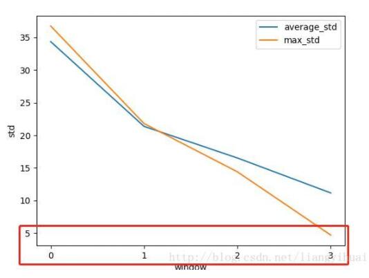
修改python plot折线图的坐标轴刻度,这里修改为整数:
代码如下:
from matplotlib import pyplot as plt
import matplotlib.ticker as ticker
import numpy as np


def std_plot():
 overall_std = [34.369, 21.366, 16.516, 11.151]
 max_std = [36.769, 21.794, 14.390, 4.684]
 plt.figure()
 plt.plot(overall_std, label='average_std')

 plt.plot(max_std, label='max_std')
 plt.legend()
 plt.xlabel('window')
 plt.ylabel('std')
 plt.xticks(range(len(max_std)))
 # plt.gca().xaxis.set_major_formatter(ticker.FormatStrFormatter('%1.1f'))

 plt.show()

std_plot()
可以发现,通过上面的方法可以自定义x轴的刻度显示为其他样式,比如根据时间显示。只需要修改为:
plt.xticks(pd.date_range(‘2014-09-01','2014-09-30'),rotation=90)#设置时间标签显示格式
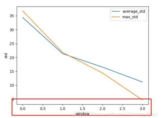
如果希望保留小数点后一位,可以这样:
from matplotlib import pyplot as plt
import matplotlib.ticker as ticker
import numpy as np


def std_plot():
 overall_std = [34.369, 21.366, 16.516, 11.151]
 max_std = [36.769, 21.794, 14.390, 4.684]
 plt.figure()
 plt.plot(overall_std, label='average_std')

 plt.plot(max_std, label='max_std')
 plt.legend()
 plt.xlabel('window')
 plt.ylabel('std')
 # plt.xticks(range(len(max_std)))
 plt.gca().xaxis.set_major_formatter(ticker.FormatStrFormatter('%1.1f'))

 plt.show()


std_plot()
以上这篇修改python plot折线图的坐标轴刻度方法就是小编分享给大家的全部内容了,希望能给大家一个参考,也希望大家多多支持【听图阁-专注于Python设计】。