详解使用python绘制混淆矩阵(confusion_matrix)
Summary
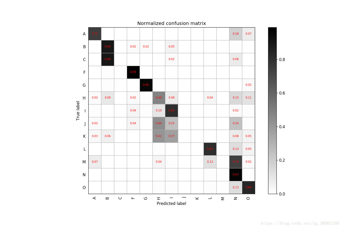
涉及到分类问题,我们经常需要通过可视化混淆矩阵来分析实验结果进而得出调参思路,本文介绍如何利用python绘制混淆矩阵(confusion_matrix),本文只提供代码,给出必要注释。
Code
# -*-coding:utf-8-*-
from sklearn.metrics import confusion_matrix
import matplotlib.pyplot as plt
import numpy as np

#labels表示你不同类别的代号,比如这里的demo中有13个类别
labels = ['A', 'B', 'C', 'F', 'G', 'H', 'I', 'J', 'K', 'L', 'M', 'N', 'O']


'''
具体解释一下re_label.txt和pr_label.txt这两个文件,比如你有100个样本
去做预测,这100个样本中一共有10类,那么首先这100个样本的真实label你一定
是知道的,一共有10个类别,用[0,9]表示,则re_label.txt文件中应该有100
个数字,第n个数字代表的是第n个样本的真实label(100个样本自然就有100个
数字)。
同理,pr_label.txt里面也应该有1--个数字,第n个数字代表的是第n个样本经过
你训练好的网络预测出来的预测label。
这样,re_label.txt和pr_label.txt这两个文件分别代表了你样本的真实label和预测label,然后读到y_true和y_pred这两个变量中计算后面的混淆矩阵。当然,不一定非要使用这种txt格式的文件读入的方式,只要你最后将你的真实
label和预测label分别保存到y_true和y_pred这两个变量中即可。
'''
y_true = np.loadtxt('../Data/re_label.txt')
y_pred = np.loadtxt('../Data/pr_label.txt')

tick_marks = np.array(range(len(labels))) + 0.5

def plot_confusion_matrix(cm, title='Confusion Matrix', cmap=plt.cm.binary):
  plt.imshow(cm, interpolation='nearest', cmap=cmap)
  plt.title(title)
  plt.colorbar()
  xlocations = np.array(range(len(labels)))
  plt.xticks(xlocations, labels, rotation=90)
  plt.yticks(xlocations, labels)
  plt.ylabel('True label')
  plt.xlabel('Predicted label')
  cm = confusion_matrix(y_true, y_pred)
  np.set_printoptions(precision=2)

cm_normalized = cm.astype('float') / cm.sum(axis=1)[:, np.newaxis]
print cm_normalized
plt.figure(figsize=(12, 8), dpi=120)

ind_array = np.arange(len(labels))
x, y = np.meshgrid(ind_array, ind_array)

for x_val, y_val in zip(x.flatten(), y.flatten()):
  c = cm_normalized[y_val][x_val]
  if c > 0.01:
    plt.text(x_val, y_val, "%0.2f" % (c,), color='red', fontsize=7, va='center', ha='center')
# offset the tick
plt.gca().set_xticks(tick_marks, minor=True)
plt.gca().set_yticks(tick_marks, minor=True)
plt.gca().xaxis.set_ticks_position('none')
plt.gca().yaxis.set_ticks_position('none')
plt.grid(True, which='minor', linestyle='-')
plt.gcf().subplots_adjust(bottom=0.15)

plot_confusion_matrix(cm_normalized, title='Normalized confusion matrix')
# show confusion matrix
plt.savefig('../Data/confusion_matrix.png', format='png')
plt.show()
Result
以上就是本文的全部内容,希望对大家的学习有所帮助,也希望大家多多支持【听图阁-专注于Python设计】。